Thursday, 24 March 2016

Preview Shots: "To Heal"

Final Images for the 'Healing' Concept before Post Production 

Definition of Healing - 'Tending to heal, therapeutic. The process of making or becoming sound or healthy again' 


Inspired the use of pinks, blues and white pastel colours of the girls on the beach painting I discussed at the beginning of my blog posts, these are just a few examples of the hundreds of shots the photographer took for this shoot giving me a lot to work with and choose from which was a great idea. 
Overall I am very happy with the images for this chapter. The lighting perfectly captures the orange and yellow symbolic colouring of the healing light sun I wanted to create and the white colouring blends nicely with a summer feel. These images do need some post production work in retouching just to soften the skin as well as getting rid of the elastic hook hanging behind the dress if I were to use this image. I really liked the difference of really close up to quite long mid length and this create a more interesting range of images as well as showing both overall image and the make up in more detail. The nails I designed also were captured nicely and subtly as I wanted to make sure that all elements had been considered for that higher quality final image. 
I was extremely nervous of the day of this shoot as not only had I had had to re schedule it due me being ill as I had to consider health and safety and didn't want to spread my cold to my team and model and delay things further, it was my first final image creation and I had had problems with this model cancelling quite a few times but I felt extremely prepared and had planned out in what order every product needed to be applied and due to this the day went according to plan which was a great success. 

Social Media Development


After my presentation I felt that I was ready to continue my journey and take all the advice and constructive criticism Emma, Elizabeth and Jane had all given me. They made me aware that that I need to choose careful my fashion styling for each concept to really fit the theme and overall look as well as create different poses or crop images to create different looks and make the images more interesting rather than all the same, which I completely agreed on. They also advised me on elements such as softening skin, slimming models and getting rid of stray hairs that can be altered in post production to really make the images contemporary and more of a series of theatrical themed characters. They also agreed on keeping the images beautiful and simple rather than added photoshop effects to distort the image. 

I then decided to re awaken my professional instagram account that I had begun to make during my freelance and industry management unit. I hadn't had much to put on it that I was really proud of for a while. I now plan to add some more of my work and also hope to put my final images of this account to get my work more out into the world for others to see as social medium such as this is the way forward in todays society. I plan to link my instagram account to my final book so that those that view my book can find out more about the looks, for example products used and get in contact with me for any other questions. This is a great way for me to make contacts professionally that before university I would never have thought about doing. 


I've also begun to update my business card that I created in the freelance and industry management unit in InDesign. After attending many of the talk held at university it is also a finishing note that having business cards on me at all times is a must to make it in this industry. I want to work on my card to give the artist and professional vibe that I hope to give as a make up and hair designer. I also really need to update my website, this is something else I plan to do after university as I have gained valuable IT skills that I can not do this in my own time. 


Thursday, 17 March 2016

Test: Reflecting on 'TELEPORTING' Concept Trial


The teleporting concept is all about escapism. The definition of escapism is 'the tendency to seek distraction and relief from unpleasant realities, especially by seeking entertainment or engaging in fantasy' this is something that, in todays society, is a very common solution to every day problems that we all face. This concept is about creating that mysterious, magical character we all envisage to take us away to a place in the world of peace and tranquility or whatever he or she desires. I wanted to convey that sense of danger and mystery to convey the unknown, different  destinations we all imagine in our dreams and wish to escape to. 
This image will be the one that I will incorporate techniques in post production such as fading and movement to really enforce this power. 

The styling for this I wanted to be contemporary but have something that conveyed mystery I think that a black turtle neck would be perfect as this brings all the attention to the face and hair as well as being able to create some covering poses that are unusual and fit this theme, this can be see in the Mr Gentlemen AW/2014 catwalk. 
The make up will be all about creating a disguising, superhero mask across the face so that identity is hidden, most of my inspiration for is are editorial model images from the platform Pinterest which I have found very useful during my time at university for ideas. Celebrities such as Adam Lambert who use the dark liner and smokey eye to intensify their appearance also were a great inspiration although I wanted this look to be a little more editorial than beauty. Black works very well as the eyes will appear bright and intense and also blend in with clothing and photography. Although to make this image keep in theme with my colour symbolic palette the hands will have a painted art pattern included every colour in the palette to convey every single positive emotion I have symbolised to each colour, this will lighten the overall concept as well as linking to the emotions created in escapism.  

Smokey Eye Test  


Originally, to convey the sense of mystery and intensity, I wanted to create a subtle smokey eye on my male model inspired by many male catwalk looks. After experimenting this design it turned out nothing like I had planned, it wasn't masculine at all and more on the side of drag and wasn't as dark and mystical as I wanted this to appear. Although it gave me a good chance to practice my cut creases eyeshadow work this will not be the design I pursue in my final concept of the teleporting ability as its not as editorial or exciting as I want this concept to be.

Black Aqua Colour Band 


My next trial was to create a neat, graphic solid black mask across the eyes very similar to the images in my mood board. I used soft tape, eyeliner and black aqua colours but when removing the tape, as you can see from the images above, the mask effect was no where near as straight and precise as I had envisaged which was very disappointing. I then attempted to edit and adapt this free hand but this just made the matter worse and the mask ended up becoming too big and wide. Although the product of the aqua colour gave the solid black I was after I knew I really need to rethink this idea as it was far from ready for final image. I really was upset that this had failed but decided to not let it get me down and think of a new plan. 

Blended Black Band 


From my previous trial I decided to take off some of my models make up by blending it out. To my surprise this was creating a really statement making, tribal jungle, look that actually fit much better than I could have imagined. The brush strokes outward created a smokey and faded mask effect which I really like the look of due to the editorial feel as well as creating the intense, mysterious look I originally wanted. I was so pleased and relieved and found this was a great success that I wanted to test further as this was just by chance that this design was created.  

Blended Black Band with MAC Melon & Old Gold Pigments 


To adapt this experiment even further I decide to add some colours from my symbolic colour palette to the mask so the black was a little more interesting and eye catching. I was so pleased with the outcome of this test as the pigments blended very well with the aqua colour and, when in the light, created a great mysterious super hero mask. Although I think I may have used a little too much pigment in my test as they started to turn green, which is the chakra colour from teleportation. This whole procedure was very enlightening to me as I learnt to just keep trying even when my original idea was a fail as I do that the tendency to give up when I do not succeed first time around. I now very happy with this design for this concept and now plan to adapt this further so that the band is a little less wide and spread across the face to create that editorial, fantasy teleporting character. 

Hand Art


I felt that this concept was missing the symbolic colour palette element I was achieving to include in all my other concepts clearly. I thought a way of showing some new skill would be to experiment with creating some hand art using paint strokes to represent the pieces of art I have researched that helped me to develop my symbolic colour palette for this project. I initial used a thin brush and swiped a variety of shades and colours along the whole hand. The appear very bright and eye catching which I liked the effect of as this will look interesting when posed in the right way along with all the black elements. I think if I were to recreate this I would make it much neater with more colours to really show the emotions of each colour I have been using. 
I then tested this look when blending it all together, although this was not very successful and the colours lost all meaning and became a greeny brown distorted colour that just looked dirty and unfinished which wasn't my aim. 
This was fun to test and I will now research into other hand art created by others to see if I can gain some tips or ideas that will push this idea further on. I am just a little worried that my skills  for this style are not of the standard to be in my final book. 


Wednesday, 16 March 2016

Test: Reflecting on 'IMMORTALITY' Concept Trial


Similar to the psychic concept I wanted to create this design with a more editorial outlook in mind. The meaning behind this theme was to enjoy every day and moment in our lives as life can be so short and sweet, we have life in this world so we must live it to our fullest. 
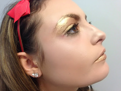
I felt as though, once research the wealth and history of the colour gold, it does represent this idea perfectly as its so rich and vibrate and full of symbolic meaning.
A lot of my inspiration for this came from the use of the new limited edition cosmetic product created by Pat McGrath, Gold 001 pigment. The look and texture this product creates was something I really wanted to recreate as it blends beautifully and gives a smooth, luxurious look, unfortunately this product sold out in minutes and was far too expensive for me to purchase so I knew I needed to test other products to get the same vibe.
As well as this catwalk shows such as Fendi SS/12 and Illamasqua SS/11 were very influential as there use of gold enhances the models features as well as looking glamorous and very high end fashion. I also decided to take the golden brow design, inspired by the Dior SS/14 catwalk, from my invisibility concept as this look was more about clean, perfect blended skin and use it in this design as it fits much better and makes the brows more defined and interesting.  


I had a problem as I was unsure which product to use of this concept I bought quite a few magazine and blog recommended golden shade products both from high end companies to high street to experiment with the texture, colouring and blending capacities that they all possess

MAC Old Gold Pigment 


This colour was so vibrate and instantly stood out from the skin which was something I really liked about this product. It was extremely pigmented which, again, was great to work with as blending out was simple and easy to do. Although when attempting to create a pattern on top with the £££ gold MAC liner it did not allow the product to stick and was a little too over powering in colour. It was great to block out my eyebrows though as my eyebrows are very dark and hard to cover. This was encouraging as my model for this concept has fair brows. If I were to use this product I would use it far more sparingly so it was more subtle around the eye as well as being able to create a pattern over the top of it. 

MAC Old Gold Pigment mixed with MAC Mixing Medium 


I was very interested to see the difference when adding a mixing medium to this product to see what effect it would create. However, I found that, although the colour again was great, it didn't blend as well as just the powder on its own and it kept smudging in the crease of my eye which was not very attractive. This technique, on the other hand, when added to the lips was more liquid like and easier to apply with gently strokes but on the eyes I do not think this use of product is right for this concept as its a little too heavy and blocked shaping wise. 

Barry M Eyeshadow Pencil in Gold


This product surprised me and I was very glad that I tested it prior to shoot as it created a little, subtle golden shine which I really liked the appearance of. Although the product was a little thick it covered my eyebrows very well and I felt as though it was a cleaner, lighter gold than the Old Gold pigment I previously tested. This product is one I will probably using on my models eyebrows in the final shoot as its long wearing and, although doesn't blend that well, covers brows completely. 

Urban Decay - Bitter Sweet & Half Baked and Illamasqua - Electrum


This test was my most successful of them all as, not only did the two colours create the colouring and shading I was after but also they allowed me work them together and on top of one another to create a criss cross cage effect. I would like to have the chance to make the lines of this pattern even neater and tidier though to really give the striking, editorial graphic eye look but overall I was very pleased with this experiment. 

MAC Old Gold Pigment


Barry M Eyeshadow Pencil in Gold 


Illamasqua in Electrum 


The lips were another element that I had to test to see which product created the clean, shiny, professional outcome I desired for this concept. I found that these three were the best as they all had that metallic shine and luxurious colouring I needed to convey in this super power ability. Although some had issues such as going a hard and creating bits this can not be worked on and developed as I progress further into this project. 
All this testing was massively helpful and reassuring as now I am aware of what works the best and how to use these products on the skin. I feel as though this whole project is making me gain a lot of product knowledge that will be very useful in the future. 


I have also started to customise some accessories for this concept to create a more high fashion style and show some of my skills in fashion styling. The golden chain represents the the hard times of when we are tied down and having a hard time in our lives, each link represents another struggle. This idea came from the Charles Dickens book - Christmas Carol. The ghost of Jacob Marley is cover in chains with each link representing the pain he has coursed others.