Tuesday 23 February 2016

Review Time Plan & Confirming Models


In my project proposal production schedule I may have under estimated the testing time, trailing and organising I would have to achieve before commencing final shoots. I think my goal of beginning to start final shoot on the 8th February was a little unrealistic and not very practical as I still had a lot of elements such as photographer, models and studio to confirm at this point. Whereas now I have that all allocated.
Due to having completed around 3 developing test shoots already I do feel very confident and prepared to start my final shoots in beginning of March giving me a little more time now to test and expand ideas.  

I have also finally set dates for my final images and after a lot of hassle with getting in contact with models and their availability dates I have worked that out as well. 
Through the long process of many phone calls and emails I felt very secure with all my choices and felt very excited to work with these models. Although I did have a crisis mid way when one of my models could no longer make her date due to prior arrangements. I did have my usual big reaction to this problem but after being calmed down by peers I solved the problem quite easily with a clear head. I was very worried and really wanted to work with and she had the perfect hair and skin type for the look in envisaged. After more calls and emails I finally was able to re schedule a date with her and made a 100% she was available this time to avoid anymore issues or stresses. From this I also got in contact with a few extra suitable models who were happy to be back ups if anyone dropped out last minute again which was very reassuring. 

Monday 22 February 2016

Fashion Styling Inspiration and Designs


For styling I would like to use clothes that are not very high end and intimidating to the everyday viewer but something that is beautiful and accessible to them but that also blends with the concept I'm designing. 
Since I attended the Alexander McQueen Exhibition, Savage Beauty at the V&A summer 2015 I have been obsessed with his work and designs he has produced. The use of defined cuts and statement like pieces are things that I would like to include in my work, although I want my clothes to appear far less intimidating and more wearable in public unlike his eye catching catwalk looks. I particularly like the spring/summer 2012 line as the colour palette resembles a very close connection to the symbolic colour language I have created. I also feel as though this line has a wide variety of materials and fabrics from lace to leather which I find brings diversity and makes the overall collection more interesting. 

Alexander McQueen Spring/Summer 2015

Alexander McQueen Spring/Summer 2015

Alexander McQueen Spring/Summer 2010

Another huge inspiration of mine is the work of Roberto Cavalli. His use and clashing of bold patterns such as animal prints and block colours is something that really interests me as its something like that I like to achieve in my clothing. The block colour specifically is one that I think would fit with my symbolic colour palette research. 
I also love the wide range that his catwalk looks present from smart shirts to extreme dresses. His maxi dresses remind me of a superhero cape flowing in the wind which clearly makes a link to my superpower project. I plan on using a fan or hairdryer to achieve the same flowing material look that Roberto Cavalli uses on his gowns. 

Roberto Cavalli, Spring/Summer 2015

Roberto Cavalli, Autumn/Winter 2015 

Roberto Cavalli, Spring/Summer 2015

As past experiences have taught me, this unit I have planned and been prepared in advance as I can and I ordered a few items of clothing online and embellishments I would be attaching and planned on beginning to style my outfits.


Although the embellishments were perfect and exactly what I wanted the clothes looked nothing like the image portrayed on screen. I felt really panicked and stressed as I had spent a lot of money and wasn't able to return them to get my money back. I then decided there was no point worrying about it and to attempt to work with what I had purchased.

 One of the items I wanted was a sequin, metallic silver and blue turtle neck top but I received it in gold and black and in the form of a crop top. Although the cut was actually really nice the colour was completely wrong so I decided to buy some blue glitter spray and cover the top and test this to see what happened. To my surprise this worked perfectly and made me feel very relieved and thankful that I have just calmed down and thought of a solution to my problem.


I also ordered a beautiful, summer, pure white lace mini dress that I received in dark tan which was very frustrating. I then thought that there may be a way to dye the dress to make it the colour I want and am in the process of trying to achieve this now. I did try spraying it white but it just came out clear and made the dress look sticky and shiny. 

A trait about myself that I have also worried about it my tendency to panic so much that I have a complete meltdown as I feel as though I have failed. I get myself in such a state and feel lie giving up. This did occur at this moment but it is something that I am really trying to face and work on alone rather than calling others to help me fix a mistake I made.  
I really learnt that there is a solution to every problem but I just have to stop over thinking and panicking so much before hand. I feel as though my panicking can make me over react as I nearly threw the top away, but as I didn't I now have another item to work with. I also learnt that ordering online products is such a gamble and from now on I intend to go out in person to view possible outfits as this way I know exactly what I am getting.  


Sunday 21 February 2016

Designing Adapted Face Charts


For me, social media is a great way to gain inspiration and new ideas. This week was New York Fashion week and through these technologies such as Snapchat and Instagram I was able to gain access backstage at M.A.C. cosmetics. I follow many companies such as these and find they are great way to learn new techniques, latest products and how to use them. 

The element that caught my eye the most was the face chart designs. They were drawn from scratch with pens, pencils and make up products in an very artistic and new fashion to myself. 
As I need to update my face charts I thought I would attempt this style of design too and see if it worked for me. 


The three above are my practices of this style of design. As much as I enjoyed being able to sketch and draw for this project I did find that it was much harder to replicate that it looks. I have always loved to draw but over the years I have forgotten this passion of mine so I thought this would be a good time to try again. The professional images have lines that are very accurate and I found it very tricky to re create this look. Although I am quite happy with how mine turned out as a first go I feel as though they are not very professional and they don't really show the make up styles I want to design unlike the real M.A.C drawings. 

This art style was good for me to test and practice with as I gained some new skills and interests but I have now learnt that for me personally it is best to stick with the original face chart layouts I am used to and can work with well as I have had a lot more experience with them at university and they showed my designs clearer. In the future, with far more practice, I would like to be able to create works just like this with more precision as I have always loved to sketch and draw. 


Saturday 20 February 2016

Test: Post Production Work on 'Time Travel' Test


After my last test shoot I thought this would be a good opportunity to gain some more skills in photoshop and other post production mediums. I felt as though I had some good images and, as I was torn between using more effects such a blurring or layering on the images or just focusing purely on the beauty side, this would be a good chance for me to test and decide the best outcome and get advice from other peers too. 

I also feel very reassured that I am collaborating with a great photographer as, although my photography skills are getting better with each shoot I do, I can clearly see that the photography is not up to the standard I want. This test shoot made me see that I cannot create the coloured gel effects by myself effectively as the colours were either far too bold or not bold enough (this can be seen in the images above).

Below are few attempts and experiments at layering, fading and a few other effects such as smoothening the skin and just generally improving my photoshop skills.


I really enjoyed spending the day working on this images and getting to grips more with photoshop in the IT sessions as it has never been a strong skill of mine. To me, the outcome is quite pleasing but I find that the layering can effect the quality of the images individually and it loses the techniques and beauty of the make up design created which I don't like the feel of and my book is about beauty for everyday people not about high styled editing. 

I do think that the first three images, without the clock work backgrounds worked better than the last three as the images appear clearer and slightly more precise. Although, I do like the effect of the clock faded with the model as it portrays the ability a little more but I think this is something I may have to put aside as it doesn't look very profession compared to the first three with just a white background.    

I learnt a lot of different issues and elements that worked well from this test that I can now progress forward knowing and adapt for my next test or even in the future after university on another project. To me I think that the effects may be a little unneeded and, after getting opinions from friends and other students, they seemed to agree too. I will continue to test, perhaps on a female next time to see the difference and, again, what works and what doesn't efficiently. As I have a good symbolic colour language now I plan to re do my face charts and also begin to think about hair styles too. 


Friday 19 February 2016

Test: Reflecting on 'TIME TRAVEL' Concept Trial


In the past most of my testing and experimenting has been on female models, therefore I feel as though I am more experienced with working on women and understanding their skin tones and face shapes but when it comes to men I haven't had has much of practice as I probably should have. As I know I will be using two males for final images I was very aware that I needed to test and see what worked and what didn't. I have also been advised that having images of men too in a portfolio is something that many in the industry like to see.
The aim and purpose of my 'Time Travel' is to move on from the past and look forward to the future but learn from every moment in our lives as it has made us who we are today. My main inspiration for this concept was the work of the Versace Men's FW/16 Catwalk displaying jackets, trousers and shirts all being covered and embellished with cogs and clockwork pieces. Inspired by the Versace shirts and jackets I intend to design and make a shirt very similar to this style.    


 I felt quite scared and nervous as I didn't wanted to apply to much make up but wanted to create a flawless but still manly look. I found that for men the cleansing, toning and moisturising process before the make up is very important to get that clean look. It also helped that my model had good skin to start with. I also wanted to test a couple of my ideas and face charts I previously designed. I decided to try two different styles for the time travel ability as I was really inspired after watch the 'Time Travellers Tife' as I noted in my previous post. Below shows the process I took and a few similar images of the final outcome with natural lighting. 


This experience was very enlightening. Trial one, although turned out better than I expected and my free hand drawing really did go quite smoothly to how envisaged, I still felt that this look was still too face paint like and didn't really show the effect of the cogs and clock work I wanted to portray as it was quite flat and lifeless.
On trial two, I felt far more positive as this gave me a chance to experiment with some special effects techniques which I was very egger to include after the guest lecture talk I attended with special effects make up artist and founder of IMATS, Michael Keys, which was very inspiring. It also shows another skill and ability that I have, which is one of the main purposes of this book to help me for my future paths. 
I felt the real cogs I placed around the forehead with spirit gum turned out really well and I was very happy for a first test on a male. Although, reflecting back on this whole experience, there are a few elements I would amend for next time. For example I would make sure the cogs fit together a little neater so that there are no gaps. I will also create more of a metallic base underneath the cogs instead of just skin toned so bring it more to life and I will also add more cogs around the and down the face and neck to intensify the overall look. 

Wednesday 17 February 2016

Research: Continuation of creating Symbolic Colour Language


Since my tutorial with Jane I have been researching different mediums further into making my symbolic colour language more elaborate to give me a wider colour palette to work with with still meaning and purposefulness to each super power concept. I also think that the use of more colours will portray each ability theme with more clarity as well as making the overall final more eye catching and interesting. 

I began with watching the recommended film by Jane that linked to the character concept 'Time Travel' I want to create. This film was very inspiring and the beauty of the cinematography really caught my eye. It also really enlightened me to what the abilities of that power is actually capable of which is something that I need to consider, especially when it come fashion styling. 


RED

This colour is known for many different emotions and meaning through out history. From passion, love and lust to anger, power and danger red can be been viewed in a variety of different ways. Red can be seen as far back as prehistoric cave art and to ancient rome where red symbolised blood and courage. 
Where it then moves to Chinese philosophy where red symbolised fire and luck. 


Giclee fine art print of Feng Shui Master Yang Wen Bo

Although when researching into red I felt this colour, from red ochre to vermillion, was too bold and intense and has the tendency to over power the other subtle colours already in my palette, although when beginning to look into reds pale colouring of pink its meaning of youth and natural beauty interested me. I wanted to include this colour subtly within my palette too. I think this colours symbolism and feeling can blend the bolder and more striking colours together beautifully as can be seen in the painting below. 

Roseus is the Latin word meaning 'rosy or 'pink'. The rose has a very symbolic meaning of beauty and nature and this is a concept that I would subtly like to develop in my project. This also makes me start to think about using objects as symbolic meaning as well as colour.


Greek Girls Picking Up Pebbles by the Sea, Lord Frederic Leighton, 1871

 This pale pastel pink and blue is also 2016 pantone trend prediction of the year which keeps my project still contemporary. Since the trend forecasting unit at the beginning of third year I have been trying to keep up to date with this industry as I find it very interesting and it really helps to know the latest and future trends. I think these colours are not only very symbolic but would work perfectly for the softer more gentle concepts such as psychic and healing. 


ORANGE

Around the world and cultures such as buddhism and hinduism believe that the colour orange is associated with the emotion of amusement, happiness and light. This is a very interesting fact to me as this is a feeling I want to put back into todays societies busy and stressful lives through the abilities concept and make up, hair and styling within my book. 
The aspect that really inspired in when researching orange was the symbolic use of this colour through Victorian art. 


Flaming June, Lord Frederic Leighton, 1896

The realism of the transparent material worn by the sleeping woman, the stunningly warm and rich oranges and the perfectly recreated surroundings are all intentional elements that are used for symbolic meaning. He wanted to portray the beauty and nature of the sunrise and sunset through the very specific colours. 
The image also symbolises the links between life and death, this can be seen through the beautiful bright women and the toxic oleander branch in the top corner.
 The dawn like colouring of the women's skins also blends beautifully with the tone of orange used, which is something that I need to think of when it comes to using colours that work well with my models skin tone so that every element blends perfectly. 

From this I am also very interesting in visiting the Leighton House Museum to see if there are any other of his other paintings  that have the same symbolic style that may inspire me further. 

The bridesmaid, John Everett Millais, 1851

This romanticism painting is another that that really inspires me. Her orange toned hair shines with bronze and gold elements to bring the still life image to life. I also find the natural beauty a real trend when it comes to this period art work, this is something that I need to remind myself frequently as I often go over the top with my editorial work and forget that more can be less. Her skin tone and gentle curl of the hair is one that I think would work perfectly for the invisibility concept, not only is it rose and gently but its blended beautiful into the rest of the image. 

Sunflower, Vincent Van Gogh, 1888

Vincent Van Gogh wanted this very famous painting of his to bring welcomeness and a homely feeling for his friend Paul Gauguin. The uses of oranges and yellows symbolism these emotions and atmosphere that he wanted to convey. Even if some of the colours do appear5 slightly dull and lifeless the overall feel can be clearly seen. This is very interesting and even the duller tones of orange and yellow still symbolise and convey the bright and warm feelings. This makes me wonder if the use of bold and bright colours are as necessary as I though and perhaps more neutral and calm tones will define my emotions and super abilities better. 

So far my symbolic colour palette contains, white, gold, blue, orange and pastel pink with hints of black to define certain aspects. This colour palette may grow as my project progresses but for now I will begin to adapt my initial face charts and really begin start test shoots to discover which of theses colours work well and not so well together. 


I have also purchased some books to light read to gain a little more perspective of colour symbolism and how it can link to the feeling and emotions I would my viewer to feel through each ability concept.  One book I already owned due to the Chinese colour symbolic project we had to do summer 2014 which was very insightful and gave me a little knowledge before this project.  


Tuesday 16 February 2016

Tutorial with Jane


As I felt that I had been working very hard on my final major project I felt very prepared and knew I had a lot to discuss with Jane. I explained what I had been up to and she seemed very pleased with the path that I am on and interested in the colour symbolic language Elizabeth had suggested to me to research. This positive but critically analysed tutorial made me realise that all the work I have been doing is paying off and makes me feel ready to continue all the hard work further. 

When scrolling through my blog she noticed my images from my first test shoot, she, although she said the images were quite beautiful and a good start, to practice more with my post production and photoshop work as well as using a hairdryer instead of a fan to really get accurate hair and clothing movement which I had never thought of but I will definitely be testing with in my next test images. 

The thing that I found most helpful today was her enthusiasm to carry on with my colour symbolic language and the links and connection to historical art and culture. She noted that to stop at the three colours I had previously looked at and used as a palette on my initial face charts may restrict me slightly and might loose the underlining theme of each superpower. After some thought and her suggested artists and books to research I completely agreed with her statement. 

From this I now intend to research into more colours with meaning and purpose that I can link to the emotions that I want my viewer to experience when looking at my final images. I will also be preparing for a test shoot later this week and considered adapting my face charts once I have established my added colours to my symbolic colour language. 


Sunday 14 February 2016

Designing Initial Face Charts


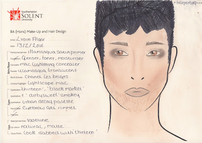
 With a good colour palette in mind, created by the symbolic colour language I research in my previous post and possible lightening for the photography in progress, I felt ready to beginning designing initial face charts for each concept. I also have been watching many films that possess my choose super abilities such as 'Jumper' and 'the avengers' to help inspire me further.

 Using the colours blue, white, gold and black I wanted to create designs that the viewers can recreate or take inspiration from to build up there confident and self belief through their appearance as well as having that editorial beauty feel. I also wanted the make up to portray the underline ability which I knew would be quite a tricky task as my skills in creating designs on face charts has never come naturally to me. Although, as I began to work, I found that as I had done so much preparation and research the initial ideas came to me with ease. I was pleasantly surprised with the outcome of these as in the past my face charts have had quite an beginners look to them but from this I realised that all my other units in the past involving creating face charts has given me so much practice and understanding that my work has made a giant leap from first year. 

Invisibility


Flight


Teleporting 


Immortality


Healing


Time Travel


Psychic


From these designs, that I am surprisingly proud of possibly due to the fact that my last ones were too much like face paint, I can begin to test on real models to see what works and what doesn't or can be adapted further. I now feel like my project has some good direction and a solid starting point so now I have the platform to really begin to create and design over the next week or so. 

Saturday 13 February 2016

Test & Meeting with Photographer


Yesterday I travelled up to London to have a meeting with the photographer I will be collaborating with on this project. After looking at all his great work over social media we both thought it would be a good idea to meet in person so that he really understood the look and style I wanted to create. I was also aware that after my first test shot that my photography skills are very basic. This was a big problem that I need to sort out and solve quickly as I would definitely be needing some help to create beautiful images. This was a very nerve racking experience for me as I tend to over worry and panic about worse case scenarios before situations have even begun but the meeting ended up going extremely well and he was excited about the ideas I was suggesting. I also got to learn as he demonstrated the technique for lightening we would use and he gave me a chance to test this myself (Images shown below). I really learnt that collaborating is such an important part of this industry to build up connections and bounce ideas off one another. If I hadn't had gone to meet him I would have never made such a good connection that I can use again in the future after university.


Before the meeting I sent my project proposal for him to read as well as creating some mood boards containing photographers work, such as Jake Hicks and Sebastian Kim, that really inspired me and has the style I wanted to recreate for my project.


I found these images all evoke a very powerful and strong atmosphere and feeling once viewing them. I believe this is due to the bold, striking coloured lighting although the post production special effects movements are something that may take away the make up focuses beauty style I wish to convey. As powerful and confidence are a few of the emotions I want to convey this is the effect that I am very determined to recreate.
 Something, through my time at university, I have always wanted to incorporate coloured gel lighting in my work but never really have the right opportunity to do so. As symbolic colour is a very important element in my project now it is the perfect chance to work with it. I now need to keep on testing and practicing this technique as I know it is something I haven't done before but knowing I have a good photographer to collaborate and help me with this is very reassuring and a relief so now I can focus on designing each look. 


Thursday 11 February 2016

Research: Creating a Symbolic Colour Language


The last couple of days I've spend researching the history and symbolism of colour to get a a solid colour palette for my final major project. I wanted to apply colours that evoked emotions of power and confidence but for this I needed to understand the history of the meaning of colour. 
After watching the inspiring BBC documentary 'The History of Art in Three Colour" Episodes Blue, White and Gold, suggested by Elizabeth, I was completely enlightened and I instantly felt as though my project could contain the meaning and importance and that I hoped to achieve and give to the audience that see my book. 

BLUE
The nature of blue is that it cannot be touched from the sea to the sky and its horizon. Dr. James Fox, the presenter of the show said Blue captures imagination and mystical new worlds beyond our own. 
The symbolic meaning of blue was very interesting to discover. As there are such a wide variety of blues from ultra marine, cobalt blue, lapis lazuli to azure the meaning varies. 

 The Old Guitarist, 1903, Pablo Picasso 

Through Pablo Picasso's blue period it is said that blue represents his descent into slight schizophrenia and depression as well as difficult, dark times ahead and encounters we all face. From this I instantly made a connection to the audience I am trying to reach out to as many in todays society are faced with these issues on a daily basis. 

Venus, 1962, Yves Klein

On the other, more uplifting hand, Artist Yves Klein wanted to create a colour that helped him to escape. For a short space of time he wanted to experience freedom and set aside his everyday life as most do in todays society wish for. Escapism is something I want my audience of my book to be able to create for themselves by using my designs and images to create there own envision of power and freedom. His colour 'International Klein Blue' was a revolution and used through all of his art work as a form of escapism for himself. 

From this I now intend of using a variety of blues as part of my colour palette to symbolise the hard times we all face but that there is a solution and a way to escape to a mystical realm just for small amount of time to give us that time to breath we all need to function. 

WHITE
History has shown that white is an extremely dominant and powerful colour. This can be seen from the dictator Mussolini's obelisk monument and his urban fantasy of a white city, EUR in italy. He believed white was a colour of conquering and power as it has the ability to reflect the sun. 
Although whites symbolic meaning dates further back to the civilisation of ancient Greece. They believed it symbolised beauty and purity and the gods. This again links the god like resemblance and powers I want to portray through my final images. 

Apollo Del Belvedere
  
Art Historian, Johann Joachim Winckelmann, once gazing upon the statue of Greek god apollo, said he had never had seen true beauty like it, the white conveyed the simplicity, innocents, clarity and natural health that we have in this world.

These are all elements that I want my audience to reestablish that they have within themselves just as we did once as children dressing up as superheroes. I also be including white as a bit part of my colour palette through make up, hair and clothing to symbolise beauty and clarity we all have. 

GOLD 
Gold is a colour that instantly defines wealth, status and power but I never truly understood why until I became this research. Ancient civilisations believe that gold and the sun were one of the same. To honour the heat and light of gold was to honour the sun. 

Tutankhamun's Death Mask 

As well as this the egyptians took this a step further and believed that gold contained magical powers as it never corroded, never rusted and never lost its shine. They believed it had immortal abilities. Tutankhamun's sarcophagus contained 110kgs of solid gold as he believed he could be brought back from the dead. This is one of the themes that one of my images is based on so this factor was very interested to me as it is something I can use and help to create my symbolic colour language.

Gustav Klimt, The Kiss, 1908-1909

Austrian artist Gustav Klimt believed that gold was scared, precious, spiritual and of other worlds. He created a series of golden paints including a variety of gold techniques such as gold leaf and gold paint on top of shellac and plaster to create a jew like feel to his image. He wanted to capture the beauty and glory of gold as he believed gold was becoming too common in his society. 

This too is something that connects gold to my work I want to create. Gold reflects the things society today holds scared, one of those things meaning time and being confident to be oneself. Using gold in my colour palette will also give be the opportunity to using different textures and objects in my designs as well as special effects products. 

This research, although at first felt quite overwhelming, made me get a clear understand and meaning for the colours I wish to work with now in my designs. Using similar colours through out will also link all my images together rather than them all being separate categories. As well as colour symbolism I will now look into perhaps object symbolism for all of the abilities I will be creating and looking for connections there as well as beginning to start designing face charts with these colours.